In the history of graphic design, there have been some incredible logos that are easily recognizable in countries all around the world. The logos we are focusing on today are timeless, influential, and paved the way for other designs that were created after them. Here are the top logo designs of all time:
1. Ford Logo
The classic blue Ford logo that we all know and recognize was created in 1907. What many people don’t know is that the Ford logo is actually a variation of the founder’s signature. This logo design was incredibly influential, as it encouraged other logo designs to be formulated around a signature, such as Kellogg’s and Disney. This is a great idea for a logo, as your signature is unique, and other companies can’t replicate your signature.

2. Mercedes-Benz Logo
Instantly recognizable and oh-so-simple, the Mercedes-Benz logo is a prime example of the joys of keeping things plain and straightforward. The triple pointed star was initially created by the founder, as he doodled the star on a postcard to his wife. He felt as if the star would shine above his business and bring him good fortune. As the brand evolved, the three-pointed star began to represent the three branches of the company: air, sea, and land. Geometric logos continue to rise in popularity, such as Delta and Nissan.
3. UPS Logo
United Parcel Service, also known as UPS, is easily recognizable with their brown vans with a shield emblazoned on the side. Over time, the UPS logo design has changed, but it has always utilized the imagery of a shield. This shield makes the consumer feel that their packages and mail are protected and safe. Due to this, many companies that want to instill the same values will use shield imagery in their logo.
4. Chanel Logo
The epitome of glamor, Chanel is one of the most iconic logos of all time. The logo is used heavily as a wealthy status symbol. Coco Chanel created the interlocking C’s logo, basing it off of a design she saw on a window in Nice. This logo is an example of “letterplay,” which is a type of logo that shapes and twists letters into creative styles.

5. Columbia Logo
Chances are, if you’ve seen a movie, you have witnessed the Columbia Pictures logo of the Grecian statue with a torch in her hand. This logo has deep neoclassical elements, and paved the way for other logos wanting a neoclassical touch. Logos with columns and arches are now commonplace because of the Columbia Pictures logo.
6. Volkswagen Logo
Many people don’t know that when Volkswagen first started out, its logo was surrounded by swastikas. The business directly involved Adolf Hitler, and the original logo had a stylized version of four swastikas. After World War II, nobody wanted to buy Volkswagen for obvious reasons. Over time, the logo was changed drastically, and Volkswagen had to fight its way back to the market. This is a great learning moment for any business: add political messaging at your own risk!
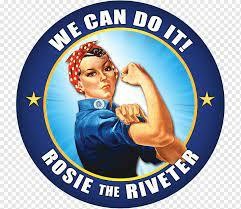
7. Rosie the Riveter Logo
While Rosie the Riveter technically isn’t a logo, she had a direct influence on many of the brands we see today. Rosie was the face of a campaign marketed towards women, encouraging them to work. If you look closely at Frosted Flakes’ Tony the Tiger, or Mr.Clean, you can see the lasting mark of Rosie the Riveter.

8. Frigidaire Logo
Frigidaire managed to create a logo that transports every customer back to the 1950’s. In 1955, America was obsessed with the idea of the future and space travel. This obsession was directly included in Frigidaire’s logo, with its streamlined and futuristic font choice. These retro fonts are experiencing a resurgence in today’s society, as they remind the customer of a time in the past.

9. IBM Logo
IBM actually began in 1889 as the International Time Recording Company. Over time, IBM has abandoned old technology and adapted to new technology. The IBM logo itself has changed many times over the years, but the most famous of all of the designs was the block letters “IBM” with the classic blue stripes. IBM used the stripes in order to portray “speed and dynamism.”
10. Nike Logo
The very famous Nike “swoosh” was created in 1971. Nike is a Greek goddess that represents swift victory. The “swoosh” was born, a checkmark with a wing, in order to portray speed. This logo design is one of the greatest, if not the greatest, examples of abstract design.

11. Apple Logo
In the beginning, Apple had a logo that was fussy and didn’t reflect the brand. After some reflection, the logo was changed to the Apple logo that we recognize and love today. This is a great reminder to always choose a logo that truly represents your product and company. The sleek, minimalistic design is replicated in many logos that we see today.
12. MTV Logo
MTV was known for pushing the boundaries. Over time, they kept the same logo shape but constantly changed the colors and patterns within the famous MTV block letters. This continually shifting concept actually helped Google realize they could use Google Doodles to represent different events and holidays. MTV had an established logo, and changed up the color from time to time, which is a great reminder to make sure your logo is established before you start changing up the colors!

13. Windows Logo
Microsoft Windows has a logo that is a colorful representation of a window. It features bold, bright colors. The window structure of the logo makes Microsoft an easily recognizable brand.
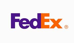
14. FedEx Logo
FedEx has a brilliant logo that features a hidden arrow. If you look closely at the white space between the “E” and the “x,” you will see an arrow! FedEx transports packages, and the arrow represents the movement of those packages. This hidden meaning inspired designers everywhere to add layered meaning to logo designs.
No matter what industry you are in, or the size of your company, your logo design is probably one of the first things that you will need when starting a new business. Your logo is your business statement. It allows customers to easily recognize your brand, even without seeing a name.
When you look at the above designs you can see that a good logo doesn’t need a bunch of bells and whistles. A good logo that stands the test of time is memorable. And sometimes that memorable can be something so simple as a dash, or one lone apple.

