Are you looking for some inspiration from the big companies on the type of logo that you need to create for your business? Waiting for some divine intervention to guide you? If so, this post should help you out. We are going to take a look into our crystal ball to determine the types of logo design trends you can expect to see in 2019.
The question of whether to redesign your logo is up to you. There’s an old saying that says “you can’t reinvent the wheel.” However, you can sometimes create a better wheel. This doesn’t mean that you should rush out and change your logo though, before putting some serious planning and thought into it.
In this post, we’ll take a look at 7 of the most popular upcoming designs to watch out for that we believe will be trending in 2017. Some of these designs have already cropped up in various circles, and more are expected to surface soon. So keep your eyes open for the following designs and redesigns shortly.
Flat Design
Flat design is the first trending logotype to emerge in the new year. This type of design involves the use of 2D drawings that are simple but elegant. They focus on the idea of representing a brand in the most simple way that presents a brand most practically and directly.
Look at the example above to see an example of flat design.
Handmade Logos
Handmade Logos all have a handmade appearance that looks like anyone could draw them. This has an appeal for brands that want to communicate a sense of old-fashioned or traditional values. It requires a sense of understanding regarding arts and crafts to create these types of logos since many of the logos appear to be made of Arts and Crafts type materials.
Gradients
Gradients are logos that use vibrant colors and textures to capture the attention of an audience. One might describe these types of logos as a type of logo “pizazz.” They can feature anything from metallic shine to colorful hues that alternate between letters. Other techniques might feature a nice blend of colors such as the one seen in the hummingbird logo above.
You can view another example of a gradient style logo here. One thing they all have in common is the fact that they are impossible to ignore because they are a bit on the “flashy” side.
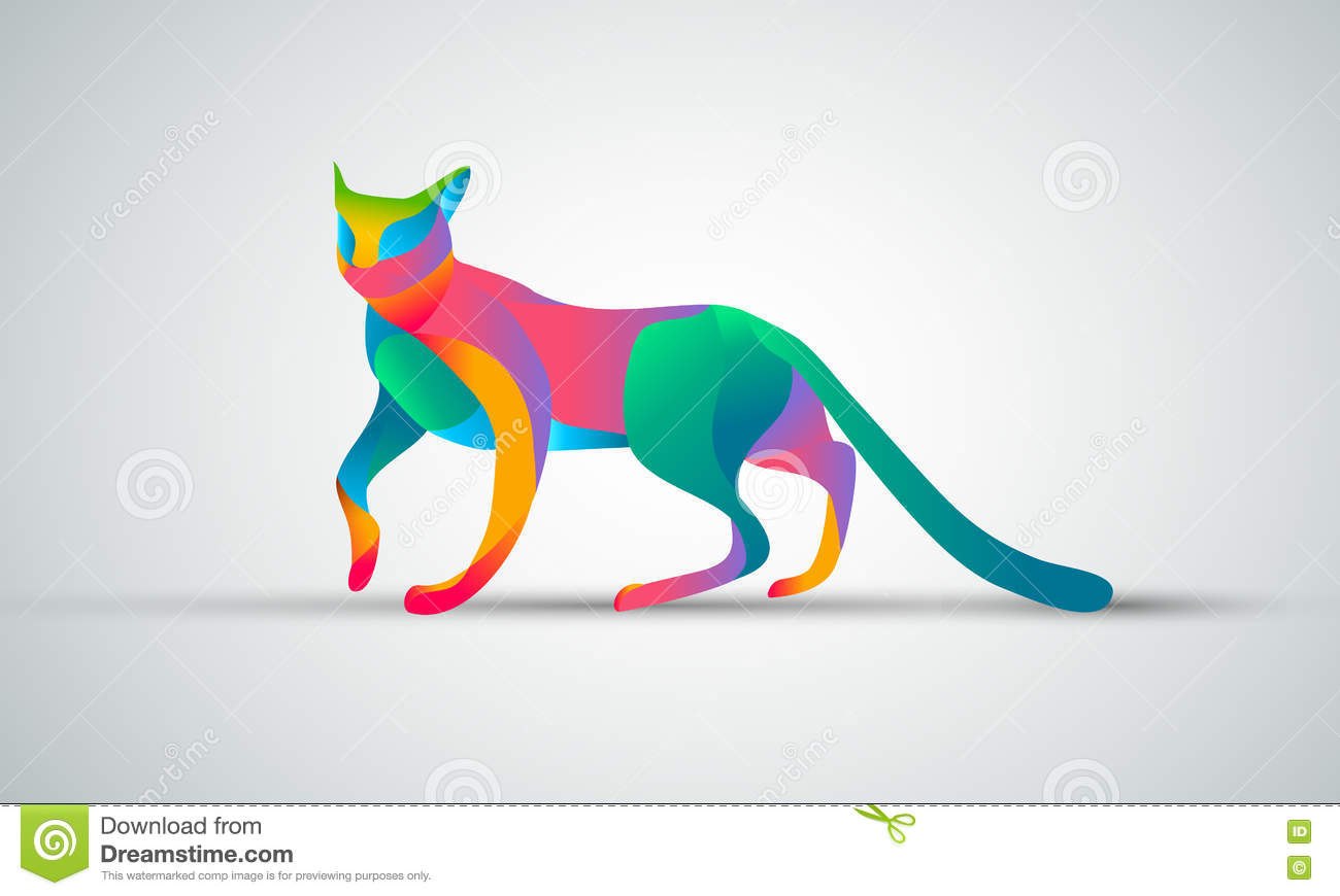
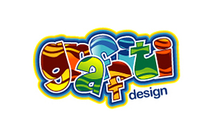
A good gradient style logo will look like the “shiny object” that cannot be ignored while still maintaining its professional look. It should be eye-catching but not overly brassy or flamboyant. Most of all, it should fit your brand. Here’s another great example of a gradient logo.
Minimalism
Minimalism has gained a lot of attention in 2017 as the web design industry continues to evolve. It is based on a smart use of white space rather than an overabundance of objects and provides a clean, professional look. Many web developers have used minimalism on their site when their goal is to direct their clients to make a shopping decision more than it is to show them their entire site.
There are advantages and disadvantages to minimalist design so you should think carefully before you decide to focus on this type of logo.
When used in logo design, a minimalist logo design will be relatively simple but beautiful and will make the best use of space such as the one seen here.
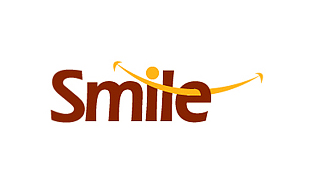
When carefully planned out, the minimalist design provides a subtle but professional way to illustrate and represent your brand without a lot of fanfare that may appeal to your target audience.
Letterstacking
Letter stacking is a technique used in logo design where the fonts and letters are the most important aspect of the branding. For example, this company called The Logo Factory chose to stack their letters by dedicating a line to each word. They also included a machinations type icon graphic for the letter “O” to emphasize their mechanical based work that they perform.

Text Logos
Text logos, like letter stacking logos, are also focused on the text. This style would work well with any business that is focused on the name more than the mascot, icon, or graphic aspects. For example, this logo for the Business Student Club makes it clear that the focus is on the name. The black background and simple but elegant text in the foreground help represent this club in a most subtle but sophisticated fashion.
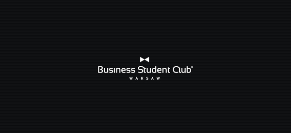
Text logos should focus on the text, obviously and it makes the whole logo design process simple when thinking about how to create a company logo.
Lettering
As the name of this type of logo would imply, a lettering logo is based on the lettering. Unlike some logos that feature a graphic beside the lettering or the name, this is all about the name only. The above example featuring the brand “Rarely Mediocre” helps this brand stand out and prove its point with its unusually scripted font.
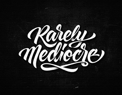
This type of logo is all about the lettering, so there’s no need for graphic artists to design pictures if you decide to go this route. Lettering would be considered a type of text logo but it is more focused on the designs of the letters, much like a football jersey for a school sports team might do.
Summary: Which one is best?
Well, there you have it. These are seven of the top logo designs and redesigns that you will likely see in 2017. Each one has its virtues, so it’s up to you as a business owner to decide which one works the best for you and your brand.
If you have a business that you want to focus on based on the name, use a lettering or letter stacking logo. If you want simplicity and order, try the minimalist design. All of these designs are different, but they all promote a brand in a way that attracts the attention of the target audience in a variety of ways.
So where should you go from here?
If you need help deciding which type of logo design is best for you, start by checking out our portfolio. You’ll find a wide variety of classy logos that fall into many of the above categories that you can choose from.
Choosing the type of logo, you will have to promote your brand is very important and should be considered a critical step in marketing and promoting your online business.
It will be seen all over the web when people are looking for your brand, so it needs to be as professional and attractive as possible.
If you need help in determining which type of logo is for you, contact us at logodesignteam.com. We are logo design experts and artists, and we can help you brainstorm ideas until we find the perfect logo for your brand.
Fill out our online form today and get a free quote and we’ll get started right away with your logo design. The only limit is your budget and our imagination.
Your logo is your name in cyberspace. Make sure you make a great impression!

